


Voter turn out data vis.png
Image
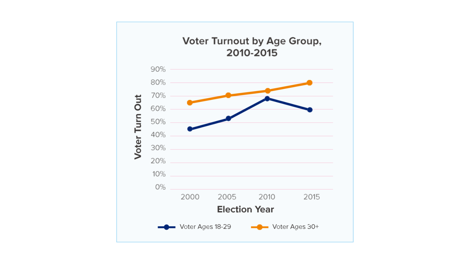
A line chart showing voter turnout by two age groups over four elections. The x-axis displays years in five-year increments from 2000 to 2015. The y-axis displays voter turnout in increments of 10 percentage points from zero percent to 90 percent. There are two lines on the graph. The orange line represents the turnout of voters aged 30 and older, and the blue line represents voters aged 18 to 29. Turnout among both groups increased from one election to the next from 2000 until 2015, when voter turnout among voters ages 18 to 29 decreased from the previous election in 2010. Since 2000, voters aged 30 and older have consistently voted at higher rates than voters ages 18 to 29